
Here’s a confession: I’ve been using the same brand colors for over 20 years, and I was getting a little bored. So I gave my website a refresh.
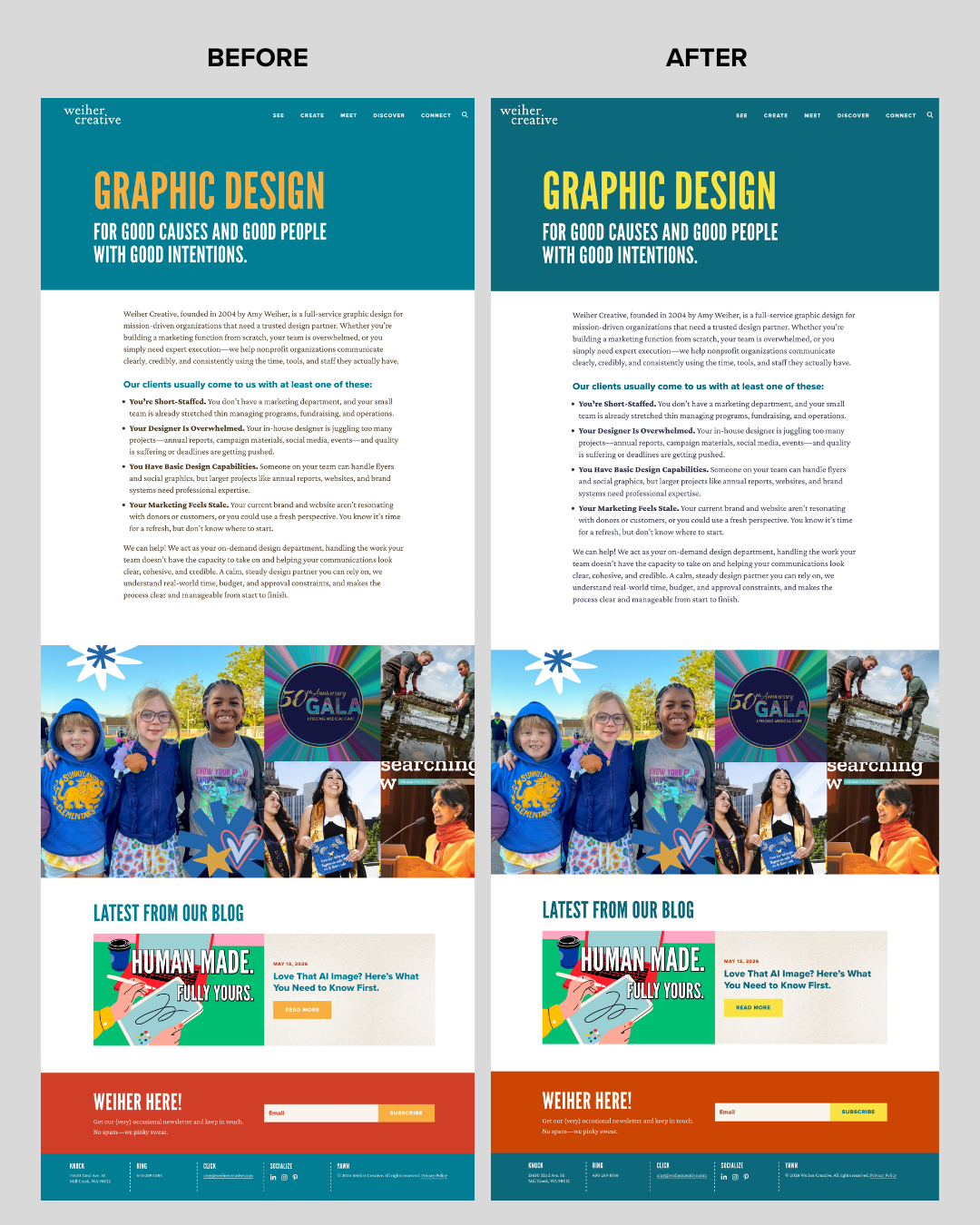
But the real reason wasn’t boredom—it was overdue. I’ve known for years that some of my header text didn’t have enough contrast against my background colors. As someone who tells clients to check their accessibility compliance, I figured it was finally time to practice what I preach and run a proper WCAG audit.
Here’s what I found
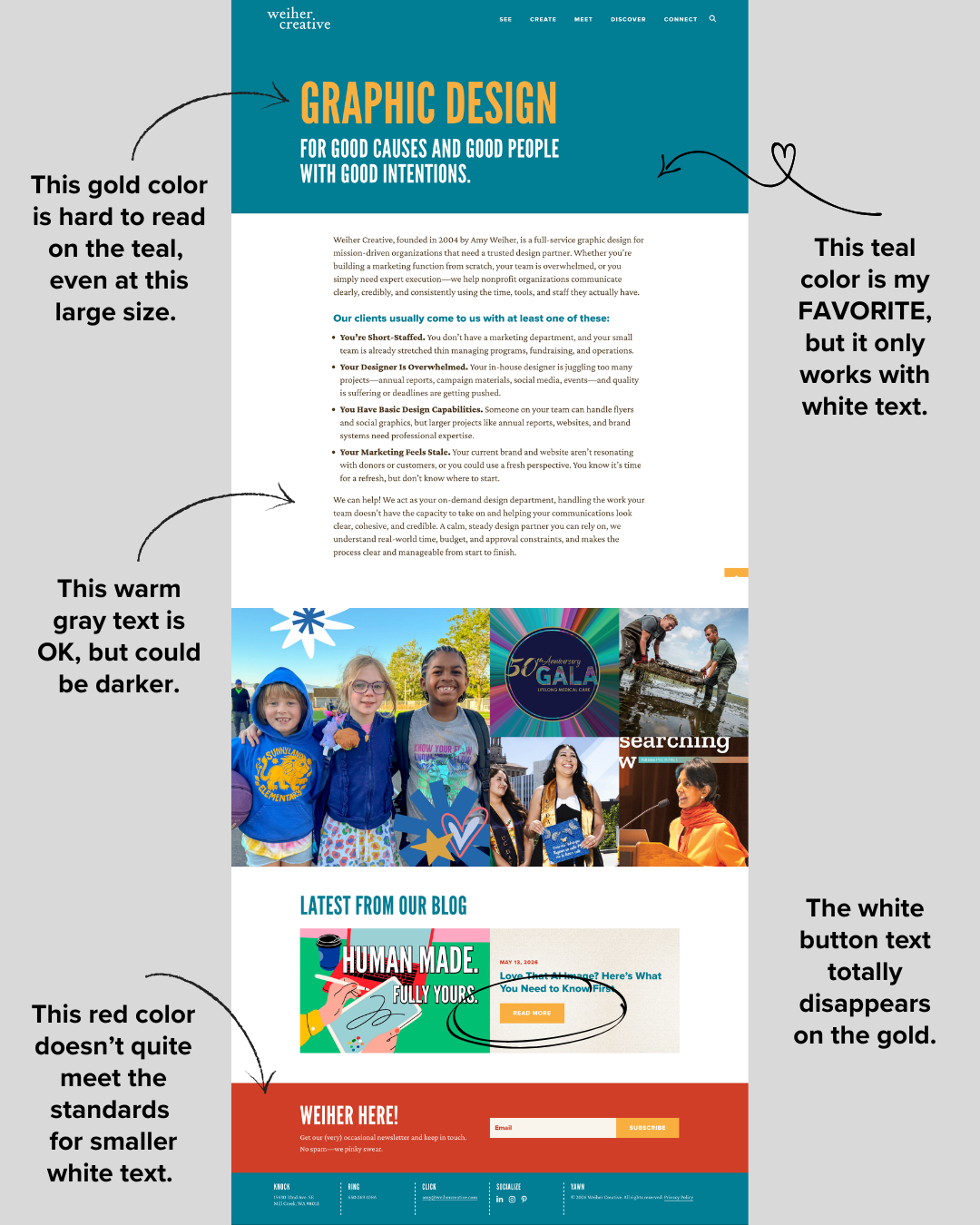
A few problem spots jumped out right away: my gold header text was hard to read against the teal, even at a large size. My favorite teal only worked well with white text layered on top of it. My red call-to-action background didn’t meet contrast standards for smaller white text. And my body copy, while technically fine, could’ve been darker and easier on the eyes.
None of these were dramatic failures. They were the kind of small compliance gaps that are easy to overlook when you designed something yourself two decades ago and have looked at it every day since.
What I changed — and how
I started at coolors.com to generate a few palette options that kept the spirit of my original brand colors but nudged them toward better contrast. From there, I ran each combination through a WCAG contrast checker to confirm the pairings actually passed—not just “looked fine to me,” but met the real accessibility standard.
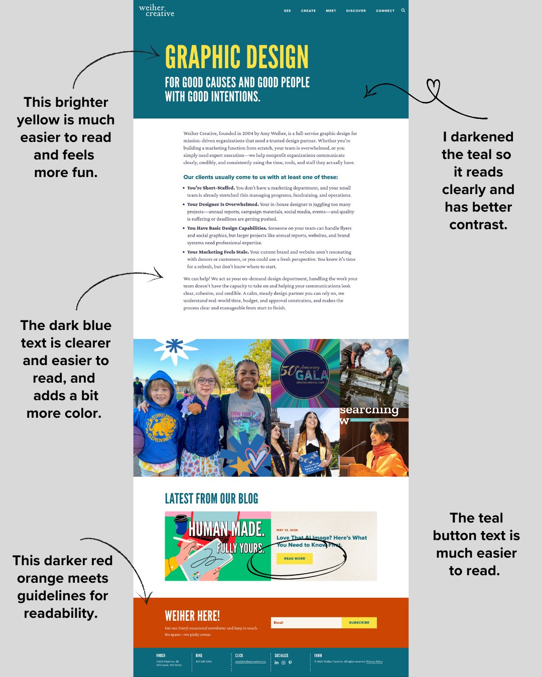
The result: a brighter yellow instead of gold, a slightly darker teal, a darker red-orange instead of red, and darker body text throughout. The brand didn’t change. The vibe didn’t change. But now every color combination on the site actually meets WCAG contrast guidelines.
Why this matters beyond aesthetics
If your website’s text doesn’t have enough contrast, you’re not just making a design choice—you’re creating a barrier. People with low vision, color blindness, or who are simply reading on a phone in bright sunlight may not be able to read your content at all. For organizations whose entire mission is serving people, that’s worth taking seriously.
The good news: you usually don’t need a full rebrand to fix it. In my case, it took an afternoon, a free tool, and a contrast checker. When’s the last time you checked your own site’s accessibility? If it’s been a while—or never—I’m happy to take a look.