In January, while converting my book into an ebook, I discovered three significant typos that had managed to hide in plain sight. They weren’t buried in the fine print; two were in chapter headlines and one was inside a designed pull quote graphic I had built myself (that one really hurt). Despite the fact that five different people had read the manuscript more times than I can count, we all missed them.
This isn’t a story about a lack of effort. It’s a story about how the human brain is wired.
The Proofreading Liability
When we read, our brains don’t actually process every individual word. Instead, they engage in cognitive pattern-matching, predicting what the text says based on what we expect it to say. While this efficiency is great for everyday reading, it becomes a major proofreading liability.
The more familiar you are with your content, the stronger this effect becomes. This creates a paradox: the people most qualified to review a project—those who know the material most deeply—are actually the most likely to read right past an error. Your brain “sees” the correct version because it knows what is supposed to be there, smoothing over extra words or repeated “it”s without you even noticing.
Evaluation Mode vs. Reading Mode
Headlines and designed graphics are especially vulnerable to these blind spots. You might assume that short, prominent text would be the easiest place to catch a mistake—there are only a few words, they’re in large type, and everyone reads them. In practice, the opposite tends to be true.
Headlines are processed quickly by design. Readers and reviewers scan them for meaning, not accuracy. Our brains confirm the idea and move on without reading word by word. And once a piece of content looks “polished”—well-designed, styled, and centered—your brain shifts from reading mode into evaluation mode. In this state, the visual finish signals to the brain that the work is “complete,” leading it to accept the text as accurate without a second thought.
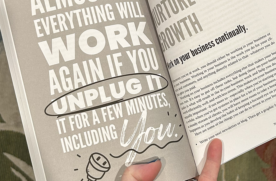
This is true for everyone who looks at it: the designer, the client, the proofreader. The more polished something appears, the harder it is to stay in a critical, skeptical mindset while reviewing it. In client work, this matters enormously—because the highest-stakes copy is often the shortest. A brand tagline. The headline in a campaign. The name on a piece of signage. A pull quote in a book.
The Power of One Fresh Set of Eyes
One of the most important lessons from this experience is that one fresh set of eyes is often more valuable than five familiar ones. Familiarity is not the same thing as freshness. When you’ve lived inside a project for weeks or months, you lose the ability to perceive it the way a new audience will. This isn’t a failure of attention—it’s a natural result of sustained familiarity.
To combat these cognitive blind spots, I’ve started treating “Does this look right?” and “Does this say the right thing?” as two entirely separate tasks. Trying to do both at once is exactly how errors fall through the cracks.
Next time you’re reviewing a designed piece, try this two-pass approach:
- Pass 1 (Visual/Layout): Focus only on the design, alignment, and styling.
- Pass 2 (Text/Proofing): Ignore the design entirely. Read the text—especially the short text in graphics—aloud, word-by-word.
It may feel a little silly, but reading aloud forces you to encounter each word individually rather than letting your brain predict the sentence. For designed graphics in particular, treating the text as a completely separate proofing task—apart from the layout review—is one of the most reliable ways to catch what familiarity hides.
Have you ever caught an error after it was already live and thought, ‘How did we all miss that?’ Or wondered what a fresh set of eyes might have caught? I’d love to hear about it!