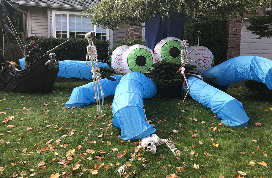
I love decorating our house for Halloween. Or at least I did before our new neighbors moved in.
We bought this house three years ago, and when Halloween rolled around, we created our usual little cemetery in the front yard, complete with headstones, a small “wrought iron” fence and random skeleton pieces. I was feeling pretty good—it was cute, and nobody else on our street was doing much in the way of decorating. Then on Halloween, my neighbors put up their display. It looked like the Walt Disney company had set up shop in their yard. Full-size, intricately-carved headstones, an actual wrought iron chain fence, and a giant fire-breathing pumpkin-headed skeleton in the middle of it all, surrounded by fog, thunder and flashing lightning. It was AMAZING. And I was beyond jealous.
So last year we (I) decided that we needed to up our game. We turned one of our trees into a sea monster, and had skeleton pirates fighting, drowning and drinking all over the house. We even had a skeletal mermaid. We got lots of compliments and people would stop and stare when they passed by, but then the neighbors’ display went up again and my jealousy was back. Our homemade monster was no match for their pyrotechnics.
This year I wanted to go big. Really big. As in 14-foot inflatable pink tentacles big. Sure, they’re expensive, but isn’t the spectacle worth the cost? Husband disagreed. So I grudgingly pulled out the decorations and the homemade sea monster lives again.
As we were adding in the last of the skeletons, I heard one of the neighbors walk by and say “Oooh, the pirates are back!” The kids next door came out and marveled at the monster. And I realized that even though it might not look as fancy as the house down the street, it’s still worth doing. And it reminded me of a few valuable marketing lessons:
1.Personality matters. Sure, our decorations are homemade, but they’ve got personality and show that we put in the effort and creativity to make it happen and celebrate. It speaks to who we are as a family. Good branding does the same thing and sets you apart from your competition.
2. Consistency matters. When done properly, having a consistent look and message over time can feel boring (at least on the inside). But on the flip side, that means that whenever anyone on the outside sees your materials, they instantly know who you are. Like our pirates.
3. Use comparison strategically. There will always be a competitor with a shiny new logo, or a website that inspires envy. But that doesn’t mean that they’re better. They’re just different, and what makes sense for their brand might not make sense for yours. Think critically about the differences, get inspired to push your marketing where appropriate, and forget the rest.
I can’t guarantee that I won’t feel compelled to add the tentacles next year (or maybe dragons!), but I’ll read this again if I need a reminder that my good enough is still great.
Do you decorate, too? I’d love to see a photo!
Get some new perspective on your branding.
Weiher Creative specializes in setting brands apart with graphic design. We offer advice from an outside perspective that can help you make hard decisions and start moving forward. Let’s chat about it.
